Waypoint Family Office
Brand creation and custom website development for a premium Investment Office

5-7 minute read
Year: 2025
Role: Web Designer & Developer
Tools: Figma
Custom WordPress Theme
Custom WordPress Theme
Waypoint Family Office is an investment advisory firm specializing in life-long wealth management and tailored financial planning for high-net-worth families. The goal of the project was to develop their brand and website from scratch, prioritizing a seamless user experience, intuitive navigation, and a design that reflects their premium, distinct identity.
View websiteDuring our discovery meeting, we explored the fundamental question: Who is Waypoint? This collaborative session provided deep insights into the company’s goals and target audience. From this foundation, I developed three distinct branding concepts, each accompanied by carefully curated mood boards.
The process was dynamic and filled with creativity, sparking fresh ideas and innovative directions for the brand’s evolution. Ultimately, Waypoint emerged as more than just a financial service—it embodies a journey, an adventure, and a holistic approach to financial well-being. It considers every aspect of a person’s financial life, from immediate goals to long-term aspirations, ensuring a future built on stability, vision, and purpose.
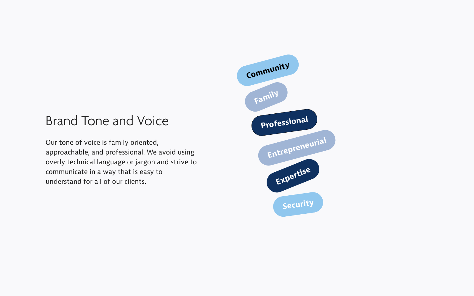
Option 1 features the Pecita font family paired with Work Sans Light, symbolizing a forward-moving journey with subtle road and nautical imagery. The brand is defined by qualities such as security, family, modernity, and professionalism.

Option 2 draws inspiration from the rugged and rural beauty of British Columbia, evoking a sense of adventure and travel. The font combination of Playfair Display (serif) and Poppins (sans serif) complements this theme, while the color palette reflects the natural beauty of landscapes and sunsets.

Option 3 embraced a professional, urban aesthetic with a classic, corporate, and clean design. The font combination of Kannada Regular and Helvetica was chosen to reinforce this theme.

After exploring multiple directions, we blended key elements from various mood boards to create a truly distinctive brand identity. I then developed a comprehensive Brand Guideline, ensuring full alignment with Corporate Compliance (Assante CI Wealth Management, the parent company).
To visually capture the essence of Waypoint—a symbol of progress and the journey clients take in lifelong wealth management—I incorporated the Market Growth Symbol. This design element represents the transition from short-term challenges to long-term, positive financial returns, reinforcing the brand’s commitment to guiding clients toward a secure and prosperous future.


The final wireframes integrate all the foundational research and creative collaboration into a responsive, custom WordPress CMS. Built with robust security features and client portals, the platform includes interactive elements designed to engage existing clients while captivating potential ones.
Custom iconography, dynamic web animations—such as the Market Growth symbol—and uniquely crafted buttons give the website a distinct, non-generic feel. The use of curves throughout the design reflects the balance between playfulness and professionalism in wealth management, reinforcing Waypoint’s approachable, family-focused identity. The result is a brand presence that feels inviting, authentic, and refreshingly unpretentious.


Here are a few of my most recent projects.


